Spiral typography guide
How to Make Printable Spiral Typography as a PNG
Make printable spiral typography with accurate canvas dimensions, readable type, transparent or colored backgrounds, 300 DPI PNG metadata, and proofing.
By RobinMaker Editorial · Published 2026-08-27 · Updated 2026-08-27 · 7 minute read
A spiral can look balanced in a browser preview yet fail in print when the letters become too small, neighboring turns collide, or the outer sentence sits too close to the trim. Print preparation begins with the physical destination rather than with decoration.
RobinMaker lets you define the canvas in pixels or millimeters and exports PNG with 300 DPI physical-resolution metadata. The browser performs the composition locally, so you can test quotations and background images without uploading them.
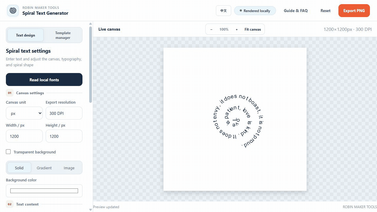
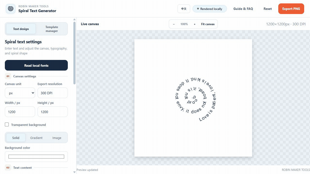
Calculate the print canvas before styling
Ask for the final trim size, orientation, bleed, and preferred raster format. If the printer specifies pixels, enter them directly. If the final size is stated in millimeters, use the millimeter unit so the tool converts the canvas at 300 DPI instead of relying on a visual estimate.
Keep important lettering away from the trim and bleed boundary. The outermost turn needs a safe margin that accounts for the full letter height, not just the spiral centerline. A larger canvas is useful only when the typography is scaled and proofed for that final physical size.
- Confirm final width, height, orientation, and bleed with the printer.
- Use millimeters for known physical sizes and pixels for exact raster specifications.
- Reserve a safe margin beyond the outermost letters.
Make the typography survive at physical size
Choose a font with open counters and distinguishable letterforms. Very thin strokes and highly decorative scripts can disappear when the design is reduced. View the preview at a scale that approximates the printed result, and judge complete words across the tightest inner turns.
Letter spacing and turn spacing solve different problems. Letter spacing separates consecutive characters along one path; turn spacing separates one revolution from the next. Increase the specific control that addresses the collision instead of enlarging every value and changing the entire composition.
- Choose a font whose strokes remain visible at the final size.
- Set font size from physical readability, not laptop appearance.
- Correct character collisions with letter spacing.
- Correct neighboring-turn collisions with spiral spacing.
- Inspect punctuation and the smallest inner curve at close zoom.
Choose a background and proof the PNG
Transparent PNG is the safest choice when the printer or another design file will supply the substrate color. For a finished standalone graphic, use a solid color or controlled gradient with enough contrast around every turn. A photographic background needs careful cropping and may require reduced opacity so the sentence remains readable.
After export, verify the exact pixel dimensions and reopen the PNG outside the browser tool. Inspect the center, outer edge, transparency, color contrast, and one crop at actual print size. If the project is expensive or large, print a small section or request a proof before production.
Work through a realistic production example
A useful printable spiral typography workflow should begin with a real deliverable, not an isolated settings panel. Consider a 300 DPI square poster with a transparent background, readable navy lettering, and enough safe space around the outermost sentence. This example gives every decision a reason: the canvas has a destination, the details have a minimum useful size, and the exported file has to survive a real production step. It is especially relevant for makers preparing spiral lettering for posters, invitations, keepsakes, stickers, apparel transfers, packaging, or another raster print workflow. Before opening the tool, write down who will use the result, where it will appear, and whether the file will be printed at home, sent to a production service, or placed inside another design. Those answers prevent attractive experiments from quietly becoming unusable output.
Translate the brief into measurable constraints. For this project, pay attention to final print width and height, pixels or millimeters, 300 DPI metadata, font size, stroke visibility, spiral spacing, and trim safety. Record those values before styling and keep them beside the browser while you work. If a printer, plotter, frame, invitation template, or packaging dieline is involved, use its final dimensions rather than estimating from the on-screen preview. The preview is a composition aid; it is not a ruler. When two requirements conflict, protect the final physical use first. A slightly simpler design that prints clearly is more successful than a detailed design whose text, paths, or motifs disappear at production size.
Create one controlled first version. Keep the default composition where it is sensible, change only the values required by the brief, and export a proof before exploring decorative variations. This produces a reference file that can answer practical questions later. The most common mistake is increasing the canvas for a larger print without scaling and reproving the font size, letter spacing, and distance between turns. Avoid it by applying one clear rule: set the physical output first and make every typographic value answer to that size. Once the reference version works, duplicate the settings or save a browser-local template, then explore color, typography, spacing, or background alternatives without losing the proven baseline.
- Write down the finished size, destination, production method, and required file format.
- Confirm final print width and height, pixels or millimeters, 300 DPI metadata, font size, stroke visibility, spiral spacing, and trim safety before changing decorative settings.
- Build a restrained reference version with the fewest necessary changes.
- Export an early proof and inspect it outside the editor at the intended size.
- Check exact PNG dimensions, physical type size, transparency, contrast, cropped outer letters, tight inner turns, and an actual-size print sample.
- Save the verified settings before creating visual alternatives.
Run a final SEO-friendly quality check
The final check should prove both the file and the explanation around it. First inspect exact PNG dimensions, physical type size, transparency, contrast, cropped outer letters, tight inner turns, and an actual-size print sample. Open the exported result in a separate viewer, because an editor can hide clipping, scaling, transparency, or color problems with its own preview behavior. View the whole composition, then inspect a crop at actual output size. If the file is intended for print, make a small test on the closest available paper or ask the production service for a soft proof. If it is intended for a plotter, test a reduced path sample before committing time and material to the complete drawing.
Next verify that another person could reproduce the result from your notes. Record the important settings, the source dimensions, the exported dimensions, and any production assumptions. Use descriptive filenames rather than replacing the only working export. Keep the original source file separate from the generated output, and do not place uploaded images or temporary browser URLs inside saved templates. RobinMaker processes creative files locally in the browser, but your own project organization still determines whether a result can be revised safely several weeks later.
Finally, review the result from the user's point of view rather than the editor's. Can the important information be understood immediately? Does the composition still work when printed, framed, folded, cut, or drawn? Are labels and instructions honest about approximations? Search-focused articles are strongest when the workflow produces evidence, so keep one screenshot of the settings and one screenshot of the finished preview. Those images make the process easier to follow and show that the recommendations come from the actual tool rather than generic design advice.
- The exported dimensions and aspect ratio match the production brief.
- Important text, lines, and motifs remain readable at final physical size.
- No unintended clipping, transparent gaps, stray paths, or edge artifacts remain.
- The file opens correctly in a second viewer and retains the expected background.
- The working settings and production assumptions are recorded for revision.
- The result follows the rule: set the physical output first and make every typographic value answer to that size.
Frequently asked questions
Does the exported PNG contain 300 DPI metadata?
Yes. RobinMaker writes physical-resolution metadata into the PNG. You must still choose enough canvas pixels or millimeters for the intended print dimensions.
Should I export a transparent or colored background?
Use transparency when another layout or production process supplies the background. Use a color when this PNG is the complete finished graphic and the contrast has been proofed.
Why does my spiral look too small on a large print?
Increasing canvas dimensions does not automatically scale the font and spacing. Adjust font size, letter spacing, and spiral spacing for the new physical output, then proof again.