Plotter guide
How to Prepare an Image for Clean Pen-Plotter Lines
Prepare photos, scans, logos, and illustrations for cleaner pen-plotter paths by simplifying contrast, edges, noise, and physical detail.
By RobinMaker Editorial · Published 2026-08-21 · Updated 2026-08-21 · 6 minute read
A screen can display tiny texture and millions of colors. A pen plotter draws physical lines with a finite nib width, limited paper area, and real mechanical travel. Preparing the source means translating visual detail into something that survives those constraints.
The aim is not to make every image black and white in the same way. It is to preserve the subject's most recognizable boundaries while removing detail that creates pointless paths.
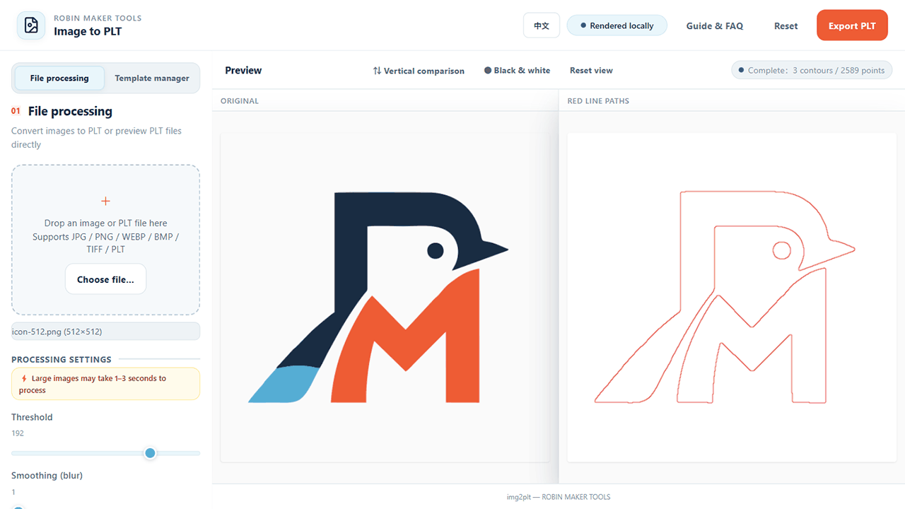
Test the prepared image in Image to PLT
Simplify the source before tracing
Crop tightly around the subject, remove unrelated backgrounds, and increase separation between important shapes. For a photograph, reduce texture and choose a composition with clear lighting. For a scan, clean dust, paper grain, and compression blocks.
- Prefer large, closed shapes over many isolated dots.
- Remove tiny text that will be smaller than the physical pen can resolve.
- Avoid soft shadows unless they are essential to the silhouette.
- Export a lossless PNG rather than repeatedly recompressing a JPEG.
Tune the converter in a deliberate order
Start with threshold because it determines the major black-and-white regions. Add a small amount of blur only if texture creates broken boundaries. Then use curve smoothing to reduce unnecessary points, noise filtering for isolated specks, and separation when nearby regions merge.
Move one slider, wait for processing, and compare both previews. If the subject disappears, return to the last clear state rather than compensating with several other controls at once.
- Find a threshold that preserves the main silhouette.
- Reduce texture with the lowest effective blur.
- Smooth only until jagged paths become practical.
- Remove isolated paths with noise filtering and inspect the remaining count.
Judge detail at the physical drawing size
Set the output width in millimeters and think in terms of the actual pen. Two contours that are clearly separate on screen may merge with a broad marker. Tiny holes may close, and dense hatching may saturate absorbent paper.
Export a test, draw it at reduced cost, and revise the source as well as the converter settings. Sometimes deleting one noisy object in the source is more effective than pushing the threshold farther.
Work through a realistic production example
A useful prepare image for pen plotter workflow should begin with a real deliverable, not an isolated settings panel. Consider turning a scanned ink drawing into stable contours while removing paper texture, dust, and details smaller than the pen can reproduce. This example gives every decision a reason: the canvas has a destination, the details have a minimum useful size, and the exported file has to survive a real production step. It is especially relevant for plotter users cleaning a photograph, scan, logo, hand drawing, or illustration before contour conversion. Before opening the tool, write down who will use the result, where it will appear, and whether the file will be printed at home, sent to a production service, or placed inside another design. Those answers prevent attractive experiments from quietly becoming unusable output.
Translate the brief into measurable constraints. For this project, pay attention to source contrast, background cleanliness, edge continuity, smallest feature size, intended drawing width, and pen thickness. Record those values before styling and keep them beside the browser while you work. If a printer, plotter, frame, invitation template, or packaging dieline is involved, use its final dimensions rather than estimating from the on-screen preview. The preview is a composition aid; it is not a ruler. When two requirements conflict, protect the final physical use first. A slightly simpler design that prints clearly is more successful than a detailed design whose text, paths, or motifs disappear at production size.
Create one controlled first version. Keep the default composition where it is sensible, change only the values required by the brief, and export a proof before exploring decorative variations. This produces a reference file that can answer practical questions later. The most common mistake is using blur and smoothing to repair a source image whose composition and contrast were never suitable for line plotting. Avoid it by applying one clear rule: remove information the pen cannot reproduce before asking the converter to trace the remaining shapes. Once the reference version works, duplicate the settings or save a browser-local template, then explore color, typography, spacing, or background alternatives without losing the proven baseline.
- Write down the finished size, destination, production method, and required file format.
- Confirm source contrast, background cleanliness, edge continuity, smallest feature size, intended drawing width, and pen thickness before changing decorative settings.
- Build a restrained reference version with the fewest necessary changes.
- Export an early proof and inspect it outside the editor at the intended size.
- Check isolated speckles, doubled edges, trapped white areas, broken contours, tiny lettering, and path density at physical size.
- Save the verified settings before creating visual alternatives.
Run a final SEO-friendly quality check
The final check should prove both the file and the explanation around it. First inspect isolated speckles, doubled edges, trapped white areas, broken contours, tiny lettering, and path density at physical size. Open the exported result in a separate viewer, because an editor can hide clipping, scaling, transparency, or color problems with its own preview behavior. View the whole composition, then inspect a crop at actual output size. If the file is intended for print, make a small test on the closest available paper or ask the production service for a soft proof. If it is intended for a plotter, test a reduced path sample before committing time and material to the complete drawing.
Next verify that another person could reproduce the result from your notes. Record the important settings, the source dimensions, the exported dimensions, and any production assumptions. Use descriptive filenames rather than replacing the only working export. Keep the original source file separate from the generated output, and do not place uploaded images or temporary browser URLs inside saved templates. RobinMaker processes creative files locally in the browser, but your own project organization still determines whether a result can be revised safely several weeks later.
Finally, review the result from the user's point of view rather than the editor's. Can the important information be understood immediately? Does the composition still work when printed, framed, folded, cut, or drawn? Are labels and instructions honest about approximations? Search-focused articles are strongest when the workflow produces evidence, so keep one screenshot of the settings and one screenshot of the finished preview. Those images make the process easier to follow and show that the recommendations come from the actual tool rather than generic design advice.
- The exported dimensions and aspect ratio match the production brief.
- Important text, lines, and motifs remain readable at final physical size.
- No unintended clipping, transparent gaps, stray paths, or edge artifacts remain.
- The file opens correctly in a second viewer and retains the expected background.
- The working settings and production assumptions are recorded for revision.
- The result follows the rule: remove information the pen cannot reproduce before asking the converter to trace the remaining shapes.
Frequently asked questions
Are photographs suitable for pen plotting?
They can work when simplified into strong shapes, but highly textured or softly lit photos often generate cluttered contours.
Should I remove the background first?
Usually yes when the background does not contribute to the drawing. It reduces noise and makes threshold selection easier.
Why did small lettering disappear?
The letter strokes may be below the chosen threshold, smoothing level, or physical pen resolution. Enlarge or simplify the lettering.